
Detroit pride is a huge thing.
Over the years, Detroit has been the punching bag of national media. Our sports teams (until a recent run by the Lions) haven't been great. And our population as a state, as a region, and as a city has been either staying the same or shrinking.
This means — and I'm speaking for myself here, but maybe you, too — sometimes, there's the urge to fight a little extra harder.
That yes, Detroit has good things going on (and it does!).
So when this image started sharing on social media awhile back about a giant "Hollywood-style" sign, people got excited.
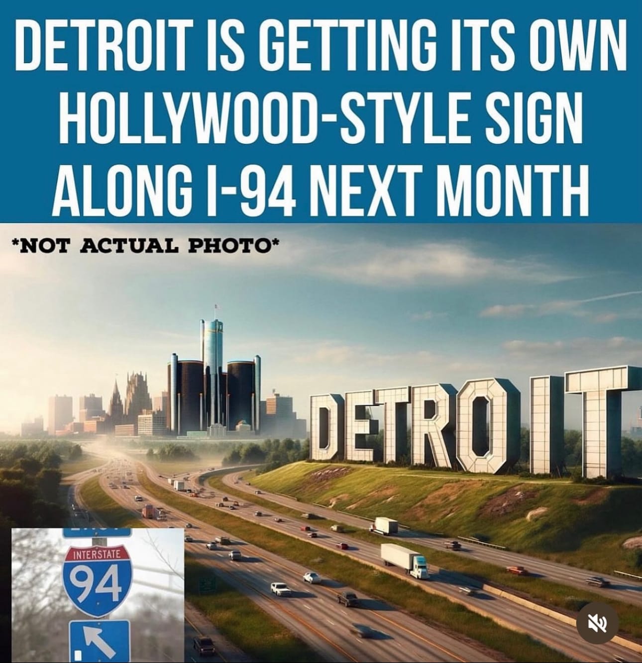
The look seemed to face south, putting the sign on I-75 near Downtown Detroit, complete with the freeway split. An easy place for people all over the region to understand.
The new sign seemed like it'd be multiple stories tall.
Sure, there was a label. "Not Actual Photo." And a "94" sign was shoved in there.
But there are so many renderings that developers have done over the years that aren't actual photos.
Plus, the account sharing it has hundreds of thousands of followers, so it must be right!
The image went locally viral, capturing imaginations.
Despite the online snark — the truth is, many Detroiters love new stuff. Stuff that we can point to in the future and say, "this is home!"
But what so many fell in love with was AI generated nonsense.
Nowhere near the actual plans, and nowhere near the actual location.
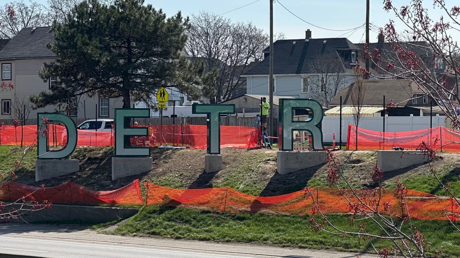
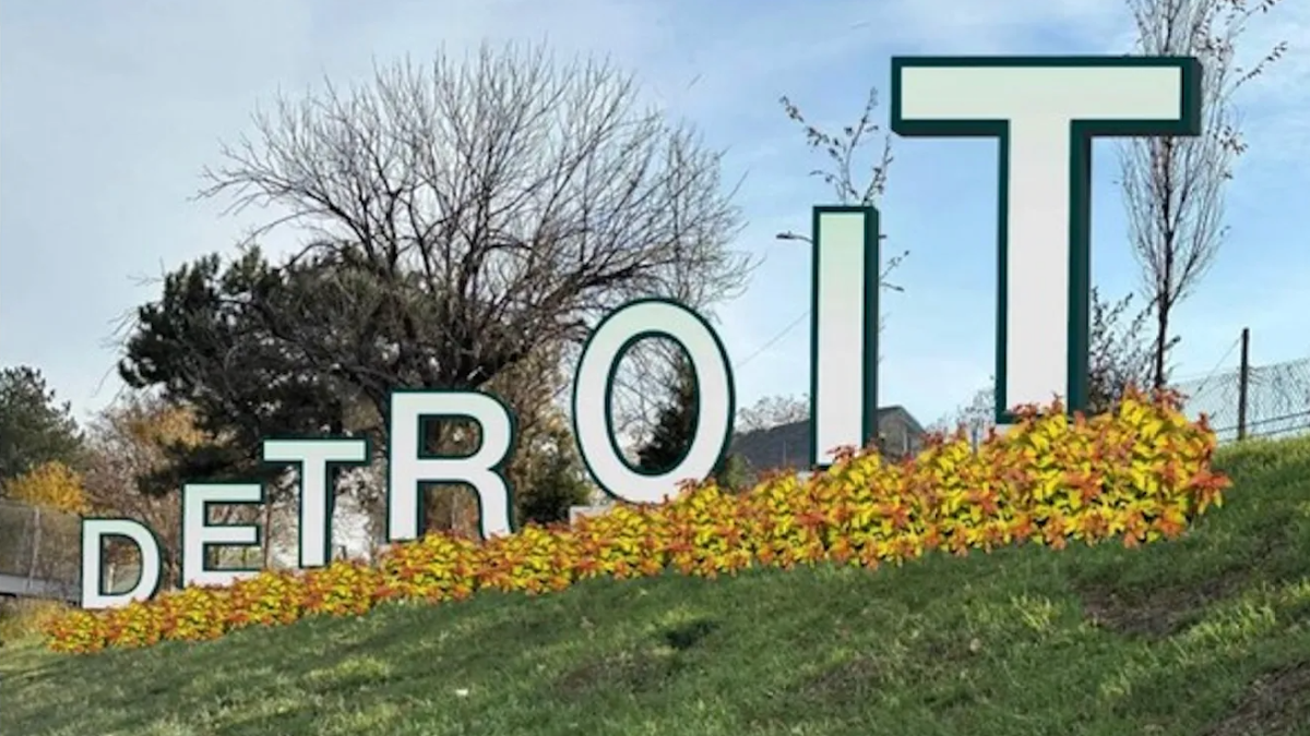
A time later, the city of Detroit released a rendering that matched the underwhelming nature of the present sign.
But the collective mental image was set. "A lie can travel half way around the world while the truth is putting on its shoes," it's said.
A lie people want to believe makes it around the world and then goes to the moon and back.
The generated image was cool, but it wasn't based in reality.
There's still people wondering why it's not on I-75. Or why it doesn't "match expectations."
To be fair, the city's press materials were pretty on the nose on size, placement, and design. But the level was set. My guess is few cared to read any actual details, and even fewer retained them if they did as the initial mental image was so strong.
One more thing
That's not to say I love this DETROIT sign. As designer Eric Thomas points out, it was probably designed by committee.
As with many civic projects, the sign wasn't designed to inspire. It seems designed to not offend.
That's why it's basically Helvetica font with a green border and some lights, tilted in a direction to make it easier to see driving down the freeway.
My late father was an artist. The worst thing you could call his art was "nice," or "it is what it is." He'd rather of you hated his work than felt nothing.
To me, this one feels empty. It's a sign that conveys information. And sure, maybe it'll grow on me.
If we want better design, we need to build a larger market for private sale and support of art here to help artists have the money and resources to say the weird or bold thing.
I'm for civic artworks. It adds to the community and helps keep artists employed. But I think we need to be realistic about the expectations.
Something with creative vision requires someone to be told "yes," and another "no."
Those are decisions that say something and are straightforward answers. Two things that terrify most politicians.
Thanks for reading.
If you didn't know, with some friends I host a daily podcast about Detroit. Daily Detroit. You can find it on Apple Podcasts, Spotify, or wherever you listen to shows.
We're also relaunching our newsletter, but this topic came up and I wanted to talk about it. We have a new website, too. I'll talk more about that in a future note.